Sociodemographic Disparities in Flood Exposure: A Tweedie Regression Analysis of Hurricane Ian
MEDS
R
Stats
Investigating the multidimensional sociodemiographic influences on flooding intensity during Hurricane Ian in Florida.
Introduction
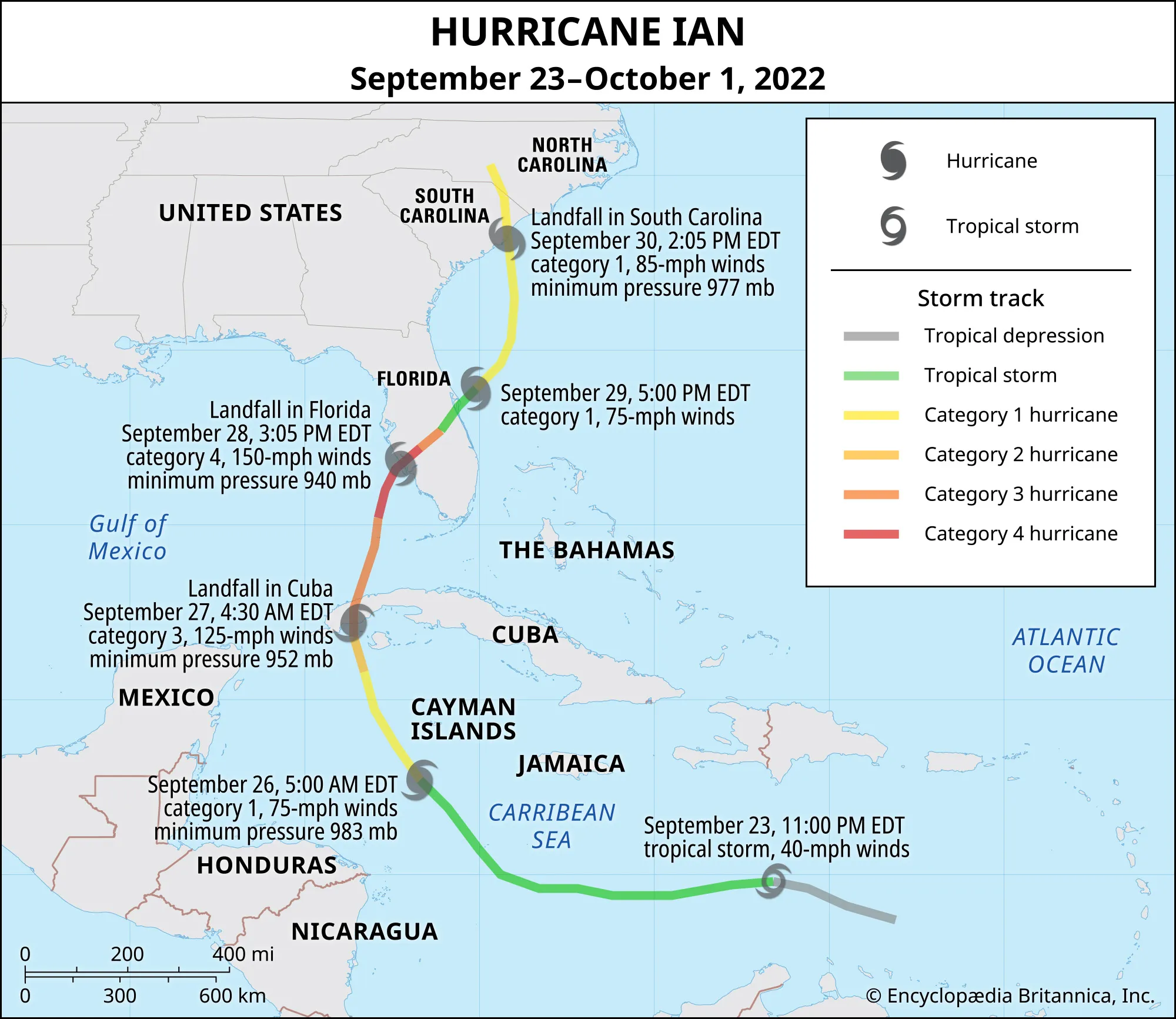
In Fall of 2022, Hurricane Ian formed South of the Cayman Islands. As the storm traveled North, reaching Cuba, the storm grew into a Category 3 (Rafferty, 2022). In less then a week, Hurricane Ian hit Florida’s west coast (near Sarasota) as a Category 4 (Rafferty, 2022). Finally, it ended its treacherous path in the Carolinas. Ian was a deadly hurricane, bringing 250 km/hr winds, disastrous rainfall, and inundations of 6-14 feet of storm surge (Walls, 2022; Rafferty, 2022; Bucci et al., 2023). About 160 people died, mostly due to drowning in the catastrophic storm surge (Rafferty, 2022 & Bucci et al., 2023). In Florida, there was an estimated $109.5 billion of damages, and $112.9 billion of total damages in the US (Bucci et al., 2023). Furthermore, about 3.28 million people in FL lost power (Bucci et al., 2023). While Hurricane Ian’s physical destruction was immense, disasters rarely impact all communities equally. Beyond wind speeds, rainfall, and storm surge, social and economic factors often shape who is most exposed to flooding and who faces the greatest challenges in recovery.
Dr. Chakraborty studied the inequitable impacts of Hurricane Harvey’s flooding in Houston, Texas, and found race, ethnicity, and socioeconomic status played a significant role in the distribution of flooding (Chakraborty, Collins, & Grineski, 2019). Black, Hispanic, and socioeconomically disadvantaged residents faced substantially more flooding compared to their counterparts (Chakraborty, Collins, & Grineski, 2019). While rainfall happens everywhere equally, flooding intensity and duration is not equally distributed as community infrastructure, drainage, and food-control investments vary between neighborhoods (Chakraborty, Collins, & Grineski, 2019).
Inspired by Dr. Chakraborty’s study, this project aims to investigate the socio-demographics impacts of flooding from Hurricane Ian in Florida. To accomplish this, we will merge flooding data (inches) and census track measurements for easy comparisons. Then, we will run a Tweedie model which is a specialized generalized linear model (GLM) (Ford, 2025).
Statistical Notation
Statistical Notation for a Tweedie model is
\[ \begin{align} \text{Flooding} &\sim \text{Tweedie}(\mu, \phi, p) \\ \log(\mu) &= \beta_0 \\ &\quad + \beta_1\,\text{LowIncomePct} \\ &\quad + \beta_2\,\text{PofColorPct} \\ &\quad + \beta_3\,(\text{LowIncomePct} \times \text{PofColorPct}) \\ &\quad + \beta_4\,\text{Dist from Hurricane} \\ \text{Var}(\text{Flooding}) &= \phi\, \mu^{p} \end{align} \]
Hypothesis
Areas with higher concentrations of low-income and minority populations are more susceptible to severe flooding when located in close proximity to the Hurricane’s path.
Null Hypothesis: There is no association between flooding intensity and the predictors - low-income percentages, minority populations, and the distance from the hurricane.
\[ \begin{align} \beta_1 = \beta_2 = \beta_3 = \beta_4 = 0 \end{align} \]
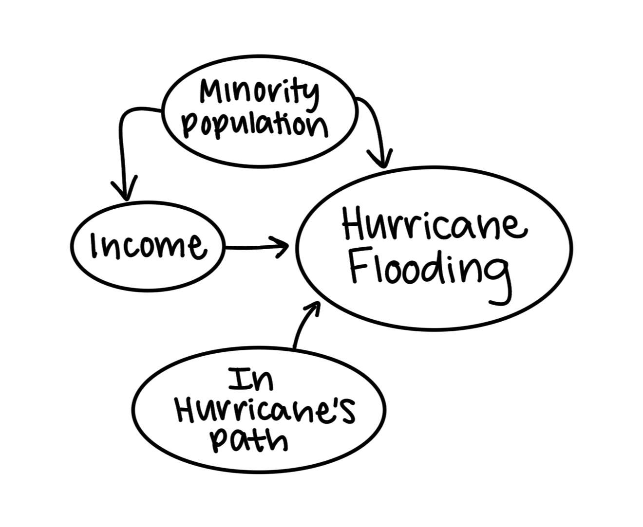
Directed Acyclic Gragh (DAG)
While precipitation is based on natural occurrences and happen everywhere with no bias, flooding intensity can be reliant on other human built mechanisms. Areas with limited green spaces, filled with impervious surfaces, are more likely to flood due to waters inability to percolate. Roe, Aspinall, & Ward Thompson find that poorer, minority communities lack open green spaces (2016), which might disproportionately cause them to flood more. Flood mitigation infrastructure (such as levees, storm drains, retention ponds, and seawalls) are important tools that influence flood severity. Poor communities tend to have limited financial resources and lack political leverage to advocate for flood mitigation projects in their communities which could result in more intense flooding. Finally, minority communities can face structural inequities and redlining that cause infrastructure improvement to go ‘unnoticed,’ increasing their likelihood to flood. Thus, a population’s percentage of low-income and People of Color could impact the flooding intensity.
Kochhar and Moslimani found large wealth gaps between racial and ethnic groups (2023). Median income for minority households tend to be less due to historical segregation and immigration status (Kochhar & Moslimani, 2023). Therefore, the DAG includes the interaction of People of Color percentage and low-income, which could impact the communities flood exposure.
The final predictor in this model is the distance (km) to the Hurricane’s path. Closer to the center of the hurricane, conditions intensify, causing stronger rainfall and wind-force. Hence, areas closer the hurricane will (most likely) experience more flooding.
Datasets
Hurricane Ian flooding data is from the Dartmouth Flood Observatory.
Hurricane Ian’s path data is vector line geometry acquired from ArcGIS online.
Florida’s census track contains various attributes of each census track and is from the U.S. Census Bureau’s American Community Survey Data.
Geometries of Florida’s counties accessed from U.S. Census Bureau’s Data Catalog.
Initial Steps
First, load all necessary libraries.
Code
library(tidyverse)
library(ggplot2)
library(stars)
library(dplyr)
library(tmap)
library(janitor)
library(glmmTMB)
library(patchwork)
library(geosphere)
library(mgcv)
library(tweedie)
library(statmod)
Second, load in all datasets. Use read_sf to load in geospatial vector data (such as gdp and shp files), and use read_csv for csv files. Piping in filters and selections for specific attributes and columns as well as cleaning up column names with clean_names() will make your code more efficient.
Code
# Flooding data
flooding_FL <- read_csv(here::here('Posts', 'hur_ian_flooding', 'data', 'hurrican_ian_flooding.csv')) %>%
  filter(`State/Province`== "FL") %>%
  select(City, `State/Province`, `Latitude (°)`, `Longitude (°)`, `Totals (inches)`) %>%
  clean_names()

# FL's sociodemographic data
fl_sociodem <- read_sf(here::here('Posts', 'hur_ian_flooding', 'data', 'ejscreen', 'EJSCREEN_2023.gdb')) %>%
  filter(ST_ABBREV == 'FL') %>%
  clean_names()

# Hurricane Ian Path
hurr_ian <- read_sf(here::here('Posts', 'hur_ian_flooding', 'data', 'Hurricane_Ian_Track', 'Hurricane_Ian_Track.shp'))

# FL counties
fl_counties <- read_sf(here::here('Posts', 'hur_ian_flooding', 'data', 'tl_2023_us_county', 'tl_2023_us_county.shp')) %>%
  clean_names() %>%
  filter(statefp == 12)
Hurricane Ian’s Path
Starting in the Atlantic, Hurricane Ian moved North to Cuba, across Florida, and into the Carolinas (Rafferty, 2022).
Hurricane Ian’s wind-force had a 240-mile diameter when it hit Florida. Therefore, I used a 120 mile radius buffer to identity what is considered “in the Hurricane’s path”.
Code
# Create 120 mile buffer
hurr_union <- st_union(hurr_ian) # Unionize hurricane lines
ian_buffer <- st_buffer(hurr_union, dist = units::set_units(120, "miles")) # Buffer
Map the Hurricane’s path with the buffer.
Code
# Map of Hurricane Ian's Buffer
tm_shape(ian_buffer) +
  tm_polygons(col = NA,
              lwd = 0,
              fill = "red",
              fill_alpha = 0.4) +
  tm_shape(hurr_ian) + # Ian's path as line
  tm_lines(lwd = 2) +
  tm_shape(fl_sociodem, is.main = TRUE) + # Extent of fl_sociodem
  tm_title(text = "Hurricane Ian's Path Through Florida") +
  tm_basemap("OpenTopoMap") +
  tm_layout(text.fontfamily = "serif", text.fontface = "plain") +
  tm_add_legend(type = 'lines', # Legend for path line
                labels = "Path",
                title = 'Hurricane Ian') +
    tm_add_legend(type = "polygons", # Legend for buffer zone
                labels = "120m Buffer Zone",
                fill = "red",
                alpha = 0.4)  +
  tm_compass(position = c('left', 'bottom')) +
  tm_scalebar(position = c('left', 'bottom')) +
  tm_credits("Figure 1")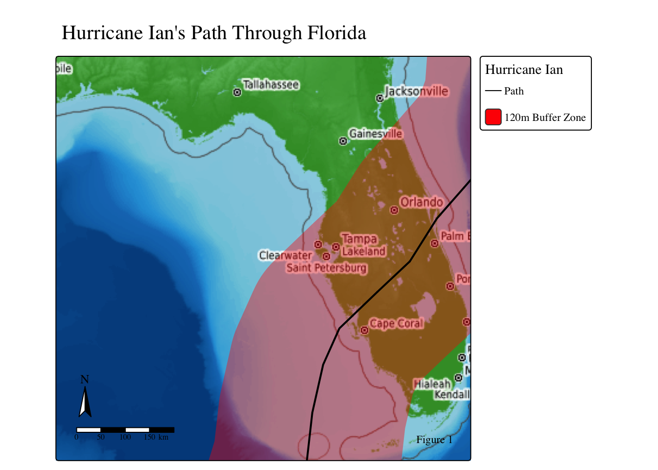
Data Wrangling
Datatypes
While the flooding data has longitude and latitude columns, it is not read as a geometry. Therefore, we need to use st_as_sf to change the datatype to simple feature (sf).
flooding_FL_sf <- st_as_sf(flooding_FL, coords = c("longitude", "latitude"), crs = 'EPSG:4326')Coordinate Reference Systems
It is always important to know the geospatial data’s coordinate reference systems (CRS). The CRS defines how the geospatial data is located and plotted. There are 2 CRS types: geographic (how the data is plotted on the 3D globe) and projected (how the data is plotted on a 2D map). It is important to use the correct CRS for your data and intended goal. Additionally, when merging or plotting geospatial data, the CRS must be the same CRS. Matching CRSs ensures that all spatial data layers align correctly, calculations are meaningful, and analytic results are trustworthy.
Therefore, we need to check and change CRS using st_transforms to ensure all CRS match.
Code
# Change the flooding df CRS
flooding_FL_sf <- st_transform(flooding_FL_sf, st_crs(fl_sociodem))
hurr_union <- st_transform(hurr_union, st_crs(flooding_FL_sf))
# Check if CRS match
st_crs(flooding_FL_sf) == st_crs(ian_buffer) [1] TRUEst_crs(flooding_FL_sf) == st_crs(fl_sociodem)[1] TRUEst_crs(flooding_FL_sf) == st_crs(hurr_union)[1] TRUEst_crs(ian_buffer) == st_crs(fl_sociodem)[1] TRUEAdd Column: Distance (m) from Flooding Point to Hurricane Line
GOAL: Calculate the distance (km) from each flooding point to the hurricane’s path using dist2Line, and put the distance calculation in a new column called dist_hur.
Code
# For 'dist2Line' CRS need to be in EPSG:4326
flooding_FL_espg <- st_transform(flooding_FL_sf, 4326)
hurr_union_espg <- st_transform(hurr_union, 4326)

# Make Points and line coordinates
point_coord <- st_coordinates(flooding_FL_espg)
line_coord <- st_coordinates(hurr_union_espg) [, c("X", "Y")]

# Find distance from flooding point to hurricane path
dist_hur <- dist2Line(point_coord, line_coord)

# Add distance (m) measurements into a new column
flooding_FL_sf$dist_hur <- dist_hur[, "distance"]
flooding_FL_sf$dist_hur <- flooding_FL_sf$dist_hur / 1000 # Covert to km


# Remove unnecessary objects
rm(list = c("flooding_FL_espg", "hurr_union_espg", "point_coord", "line_coord"))
Code
# Map pf the flooding data's distance from the Hurricane
tm_shape(flooding_FL_sf) +
  tm_dots(fill = 'dist_hur',
          fill_alpha = 0.7,
          fill.scale = tm_scale(values = c("firebrick", 'red','orange','gold',"grey35",'grey50',"lightgrey")),
          fill.legend = tm_legend(title = "Distance from Hurricane\nIan's Path (km)")
          ) +
  tm_shape(hurr_ian) + # Ian's path as a line
  tm_lines(lwd = 1.5) +
  tm_add_legend(labels = "Path", #. Add legend for path
                type= "lines",
                title = "Hurricane Ian"
                )  +
  tm_layout(text.fontfamily = "serif", text.fontface = "plain") +
  tm_compass(position = c('left', 'bottom')) +
  tm_scalebar(position = c('left', 'bottom')) +
  tm_credits("Figure 2",
               position = c('left', 'bottom')) +
tm_basemap("Esri.OceanBasemap") 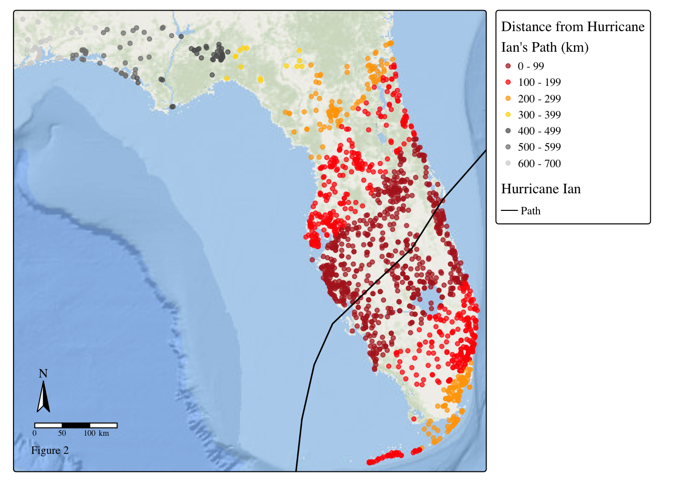
Join Flood and Socioeconomic Data
Use st_join to merge the flooding and socio-demographic data.
join_df <- st_join(flooding_FL_sf, fl_sociodem, join = st_within)Maps of Florida
Create maps to examine Florida’s flooding measurements and the socio-demographic communities.
Hurricane Ian Flooding
Code
# Map of flooding amounts
tm_shape(flooding_FL_sf) +
  tm_dots(fill = 'totals_inches',
          fill_alpha = 0.7,
          fill.scale = tm_scale(breaks = c(0, 5, 10, 15, 20, 30),
                                values = c('grey', "grey35", 'gold', 'orange', 'red')),
          fill.legend = tm_legend(title = "Total Flooding\n(inches)"),
          #border.col = 'black',
          size = 0.2) +
  tm_title(text = "Flooding in Florida from Hurricane Ian") +
  tm_shape(hurr_ian) + # Ian's path as a line
  tm_lines(lwd = 1.5) +
  tm_basemap("Esri.OceanBasemap") +
  tm_compass(position = c('left', 'bottom')) +
  tm_scalebar(position = c('left', 'bottom')) +
  tm_add_legend(labels = "Path",
                type= "lines",
                title = "Hurricane Ian"
                )  +
  tm_layout(text.fontfamily = "serif", text.fontface = "plain") +
    tm_credits("Figure 3",
               position = c('left', 'bottom'))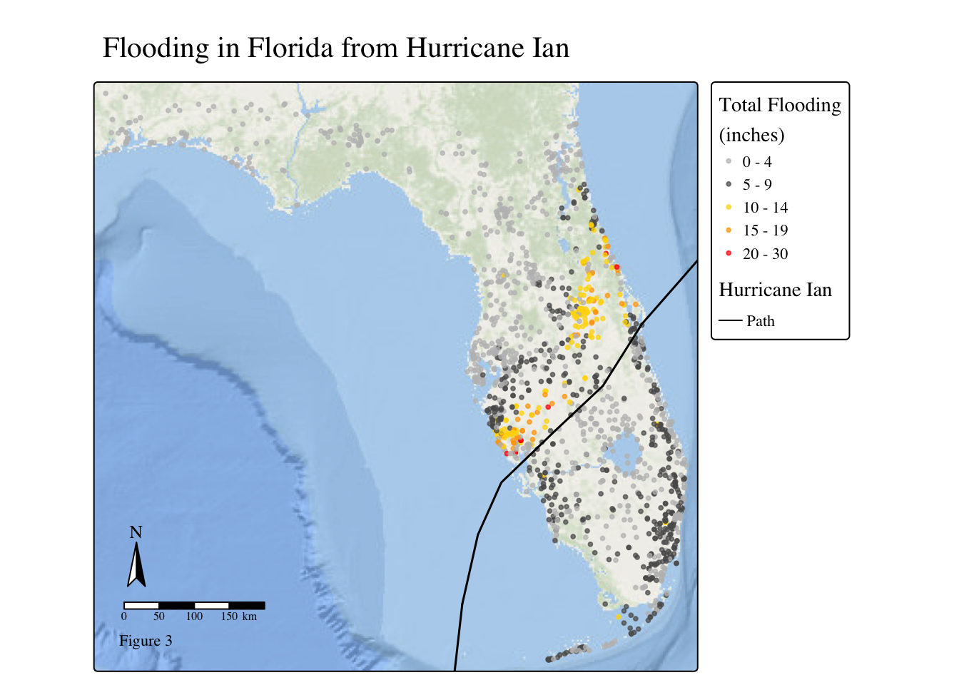
Florida’s Sociodemographics
Code
# Color palattes
my_palette1 <- c('#DEEBDFFF', '#A9CCACFF', '#399043FF', '#00740EFF')
my_palette2 <- c('#E4E4E4','#DDC5B6', '#D5A78B', '#CF895E') #CF895EFF')


# Map of FL's People of Color %
tm_shape(
   fl_sociodem,
   bbox = sf::st_bbox(c(
    xmin = -82.86, xmax = -79.71,
    ymin = 26.54,  ymax = 28.59
  )),
  crs = st_crs(fl_sociodem) ) +
  tm_polygons(fill = 'p_peopcolorpct',
              fill.scale = tm_scale(breaks = c(0, 25, 50, 75, 100),
                                    values = my_palette1),
              fill.legend = tm_legend(title = "Low-Income (%)"),
              lwd = 0.1) +
  tm_title(text = "Minority Populations Exposed to the Hurricane") +
  tm_shape(hurr_ian) +
  tm_lines(lwd = 2) +
  tm_shape(ian_buffer) +
 tm_basemap("Esri.WorldShadedRelief") +
tm_scalebar(position = c('right', 'top')) +
  tm_compass(position = c('right', 'bottom'))+
  tm_layout(text.fontfamily = "serif", text.fontface = "plain") +
  tm_add_legend(labels = "Path",
                type= "lines",
                title = "Hurricane Ian"
                ) +
    tm_credits("Figure 4")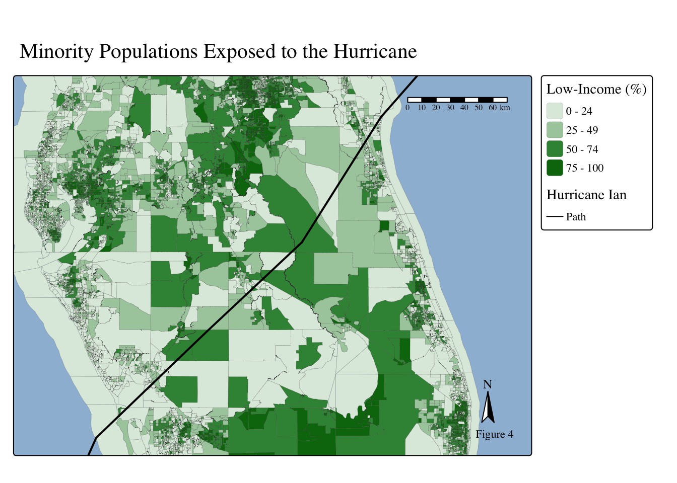
Code
# Map of FL low-income %
tm_shape(
   fl_sociodem,
   bbox = sf::st_bbox(c(
    xmin = -82.86, xmax = -79.71,
    ymin = 26.54,  ymax = 28.59
  )),
  crs = st_crs(fl_sociodem) ) +
  tm_polygons(fill = 'p_lowincpct',
              fill.scale = tm_scale(breaks = c(0, 25, 50, 75, 100),
                                    values = my_palette2),
              fill.legend = tm_legend(title = "Low-Income (%)"),
              lwd = 0.1) +
  tm_title(text = "Low-Income Populations Exposed to the Hurricane") +
  tm_shape(hurr_ian) +
  tm_lines(lwd = 2) +
 tm_basemap("Esri.WorldShadedRelief") +
tm_scalebar(position = c('right', 'top')) +
  tm_compass(position = c('right', 'bottom')) +
  tm_layout(text.fontfamily = "serif", text.fontface = "plain") +
  tm_add_legend(labels = "Path",
                type= "lines",
                title = "Hurricane Ian"
                ) +
    tm_credits("Figure 5")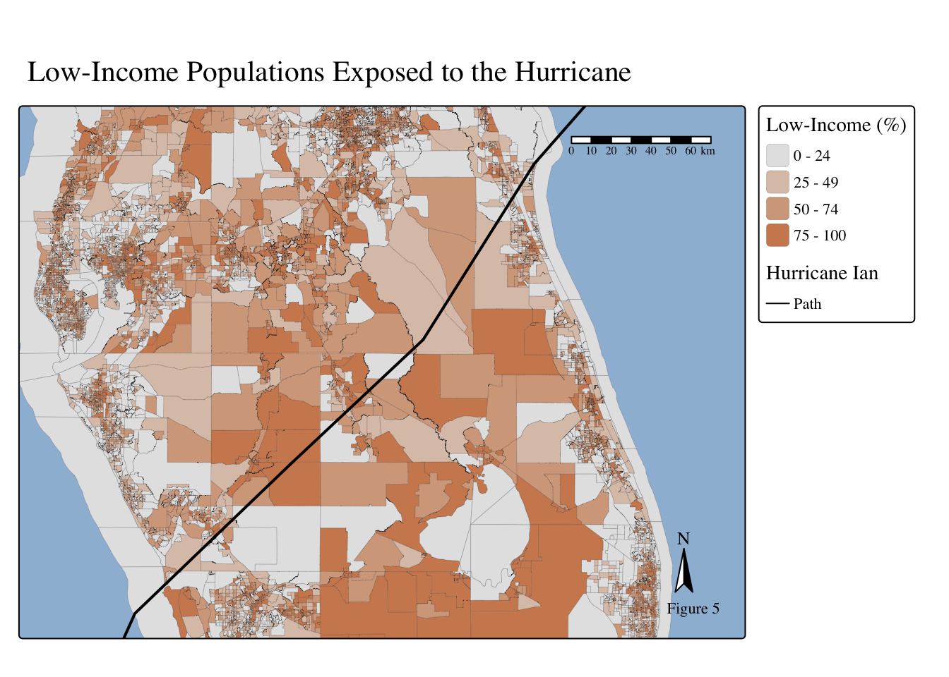
The Stats
Model Investigation
First, it is important to examine the distributional properties of our data and assess whether the normality assumption is reasonable. To do this, we will fit a simple linear regression model, visualize the residuals, and generate a histogram of the response variable (flooding).
# Linear Model
invest_model <- lm(totals_inches ~ p_peopcolorpct * p_lowincpct + dist_hur,
        data = join_df,
        )
Code
# Look at resiudals
plot(invest_model, which = 1)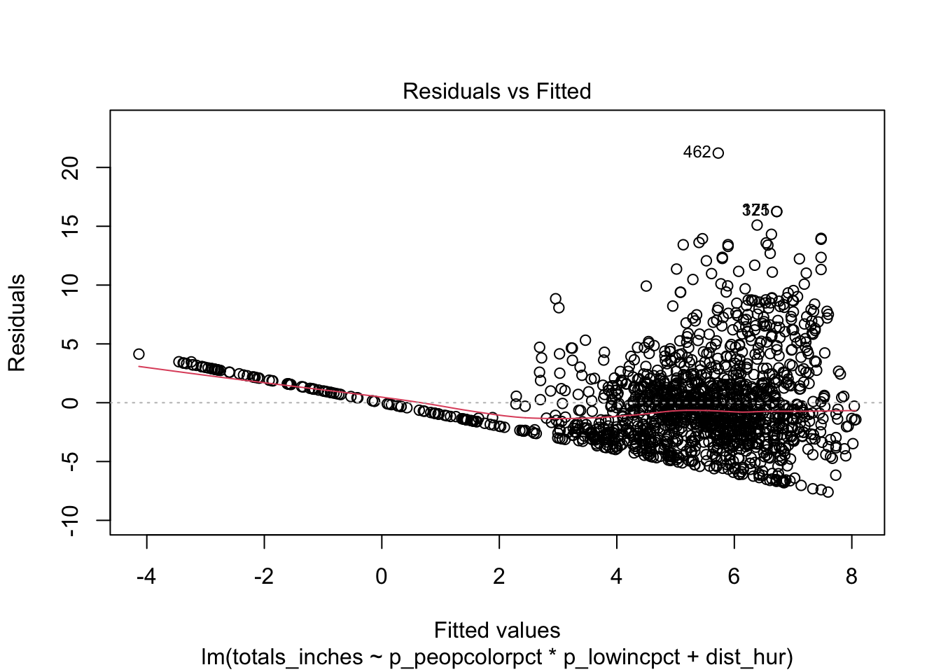
Code
plot(invest_model, which = 2)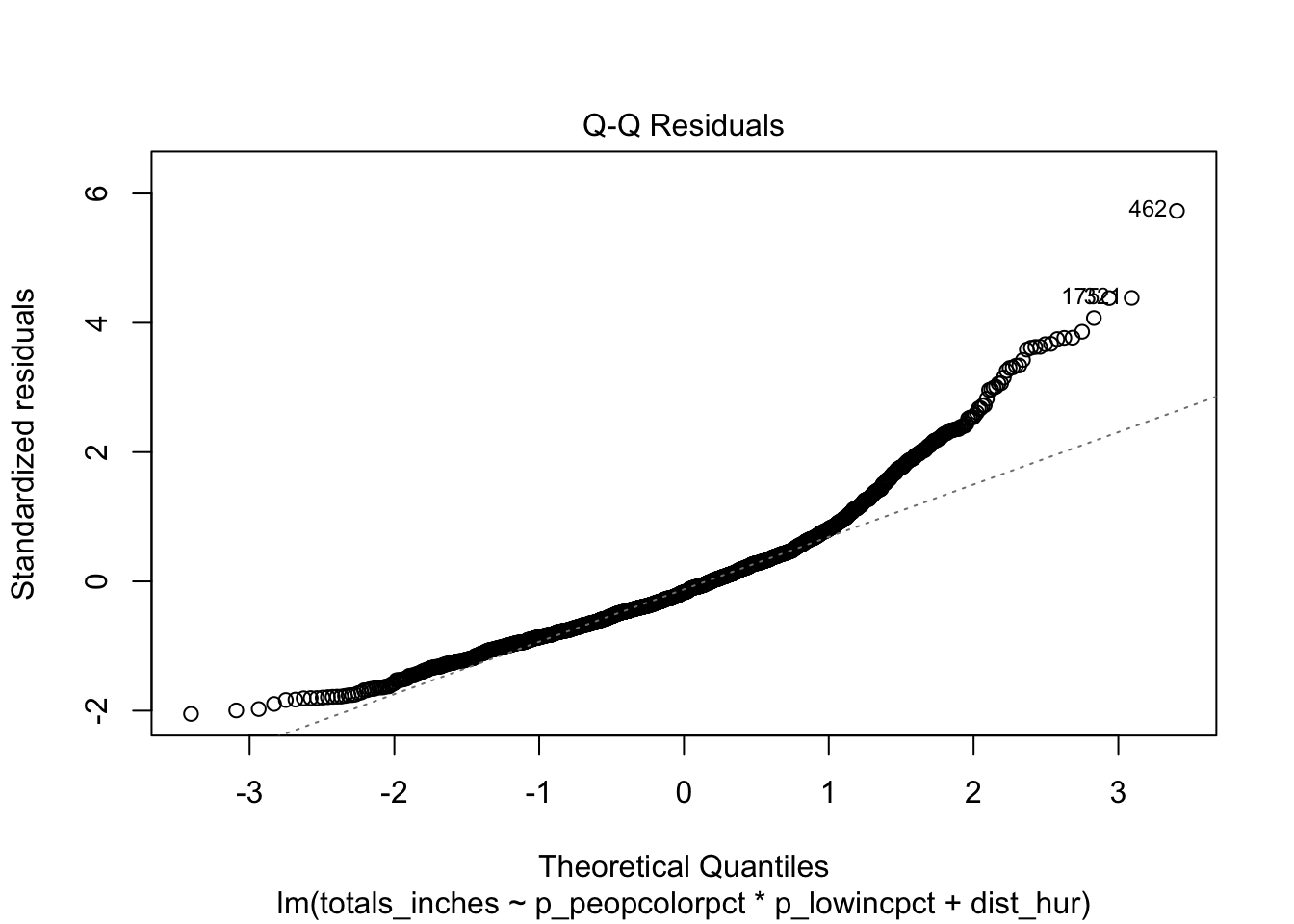
Code
# Create a histogram
ggplot(join_df,
       aes(totals_inches)) +
  geom_histogram() +
  labs(x = "Flooding (inches)",
       y = "Count",
       title = "Histogram of Flooding (inches)") +
  theme_bw()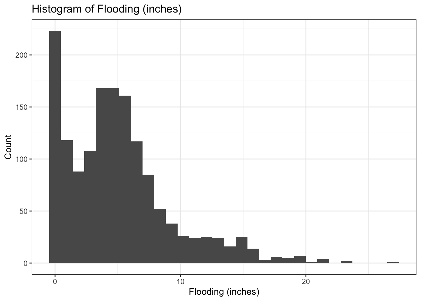
Code
# Investing zero-inflated-ness of data
print(paste("Number of flood measurements less than 0:", sum(join_df$totals_inches < 0))) # No negatives
[1] "Number of flood measurements less than 0: 0"Code
print(paste("Number of flood measurements that = 0:", sum(join_df$totals_inches == 0))) # zeros [1] "Number of flood measurements that = 0: 138"These figures show the data has strong positive (right) skew, violating the normality assumption of linear regression. Because there was no rainfall in some parts of Florida, there are 138 record zeros, making up 9% of the data. Therefore, the data is zero-inflated, skewed, and continuous positive.
The zero-inflated nature of this dataset, pulls Gamma regression off the table. The more appropriate model is a Tweedie model. Tweedie model is the standard distributions for rainfall modeling as it preserves the zeroes (Ford, 2025). The model is a special Generalized Linear Model (GLM) that acts similar to a continuous gamma distribution but can also handle the positive mass at zero (Ford, 2025).
The Tweedie model has 3 main parameters:
mu: Mean of the response
phi: Dispersion - controls the variance (higher the phi, the more variability around mu)
p: Power parameter - determines the Tweedie distribution type
| P | Distribution Type |
| 0. | Normal |
| 1 | Poisson |
| (1,2) | Compound Poisson-Gamma |
| 2 | Gamma |
| 3 | Inverse Gaussian |
Simulate the Tweedie Model
Simulating data steps:
Define sample size, parameters (mu, phi, p, and betas), and predictors’ range
Set the linear predictor and its inverse
Generate a response using
rtweedie()Create a fit model
Report model summary results
Code
set.seed(123) # Set seed

# Define sample size
n = 100000

# Define the Parameters
mu <- 10
phi <- 0.5
p <- 1.5

beta_0 <- 0.5 # Intercept
beta_1 <- 1.2 # Effect of low-income percentages
beta_2 <- 1.8 # Effect of People of Color percentages
beta_3 <- 0.1 # Interaction of low-income and people of color percentages
beta_4 <- -2.3 # Effect of distance of Hurricane's path

given_parameters <- c(beta_0, beta_1, beta_2, beta_4, beta_3)

# Define predictors ranges
p_lowincomepct <- runif(n, 0, 1)
p_PofC <- runif(n, 0, 1)
dist_hur <- runif(n, 0, 10)

# Set Linear predictor
log_mu = beta_0 + beta_1*p_lowincomepct  + beta_2*p_PofC + beta_3*(p_lowincomepct*p_PofC) + beta_4*dist_hur

# Inverse of linear predictor
mu = exp(log_mu)

# Generate response with rtweedie
flooding <- rtweedie(n = n, mu = mu, phi = 1, power = 1.5)

# Create dataframe with simulated data
sim_df <- data.frame(p_lowincomepct, p_PofC, dist_hur, flooding)

# Fit model
sim_model <- gam(flooding ~ p_lowincomepct * p_PofC + dist_hur,
        data = sim_df,
        family = tw(link = "log"))

# Summarize model
sim_model_summary <- summary(sim_model)

# Report Simulated model
sim_model_summary$family # P value
Family: Tweedie(p=1.499)
Link function: log
Code
coef <- sim_model_summary$p.coeff # Parameters of simulated model

# Making a dataframe and kable table of given and resulting estimates for comparison
coef <- data.frame(given_parameters, coef, row.names = c("Intercept",
  "People of Color (%)",
  "Low-Income (%)",
  "Distance from Hurricane Path",
  "PoC × Low-Income Interaction"))


kableExtra::kable(coef,
                  digits = 1,
                  align = 'c',
                  col.names = c("Given betas", "Simulated Model Estimates"),
caption = "Simulated Model Coefficient Estimates")| Given betas | Simulated Model Estimates | |
|---|---|---|
| Intercept | 0.5 | 0.5 |
| People of Color (%) | 1.2 | 1.2 |
| Low-Income (%) | 1.8 | 1.8 |
| Distance from Hurricane Path | -2.3 | -2.3 |
| PoC × Low-Income Interaction | 0.1 | 0.1 |
The simulation model recovered the given parameters (including the given p = 1.5), validating the model and demonstrating the inter-workings of it.
Fit Model: Tweedie Model
Create a fit Tweedie model to test the hypothesis.
# Fit Model: Tweedie Model
tweedie_model  <- gam(totals_inches ~ p_peopcolorpct * p_lowincpct + dist_hur,
        data = join_df,
        family = tw(link = "log"))

# Model Summary
mod_summary <- summary(tweedie_model)
It’s important to note, you can run the Tweedie model various ways, such as:
gam(Y ~ predictors, family = tw(link = "log")))# library(mgcv)- Do not need to specify the p; the model chooses the best-fitting p for us.
glm(Y ~ predictors, family = tweedie(var.power = #, link.power = #))# library(statmod)Must supply the model parameters manually.
var.power: defines the Tweedie p parameter
link.power = 0: log link
glmmTMB(Y ~ predictors, family = tweedie(link = 'log'))
To learn more about the tweedie model.
Model coefficients
Pulling out all the important information from the model and making a pretty kable table.
Code
# Print Just the P and link function
print(mod_summary$family)
Family: Tweedie(p=1.446)
Link function: log
Code
# Dataframe of coefficients
mod_summary_cond_table <- data.frame(mod_summary$p.table, row.names = c("Intercept",
  "People of Color (%)",
  "Low-Income (%)",
  "Distance from Hurricane Path",
  "PoC × Low-Income Interaction"))

# Kable table
kableExtra::kable(mod_summary_cond_table,
                  digits = 4,
                  align = 'c',
                  col.names = c("Estimates", "Std.Error", "T.value", "P.value"),
caption = "Tweedie Model Results")| Estimates | Std.Error | T.value | P.value | |
|---|---|---|---|---|
| Intercept | 2.4239 | 0.0587 | 41.2717 | 0.0000 |
| People of Color (%) | 0.0056 | 0.0013 | 4.3737 | 0.0000 |
| Low-Income (%) | -0.0084 | 0.0013 | -6.4669 | 0.0000 |
| Distance from Hurricane Path | -0.0067 | 0.0002 | -28.8372 | 0.0000 |
| PoC × Low-Income Interaction | 0.0000 | 0.0000 | 1.5334 | 0.1254 |
Model Coefficient Explanations
Rainfall usually has Tweedie power paramter (p) that ranges 1 < p < 2 which is interpreted as a compound Poisson–Gamma. The Tweedies model’s estimated p parameter is 1.446, corresponding to a compound Poisson–Gamma. This p estimate is good as it matches rainfall physics and is similar estimate to other rainfall Tweedie models!
Percent of People of Color, low-income, and distance from the Hurricane have a significant relationship to flooding exposure. However, the interaction of communities with low-income and People of Color does not have a significant relationship to flooding.
The percent of People of Color has a positive, significant relationship where communities with higher percentages of minorities have slightly higher flooding measurements.
The percent of low-income and distance from the hurricane’s path have a negative, significant relationship. Communities with a higher percentage of low-income (poorer communities), have slightly lower flooding predictions. This is most likely due to Florida’s coastline, consisting of wealthy, beach-front properties facing the brunt of the Catagory 4 hurricane, resulting in more damages and flooding in affluent communities. Additionally, the hurricane path results show a strong, negative relationship where flooding rapidly decreases with distance from the Hurricane.
Create Expand Grid
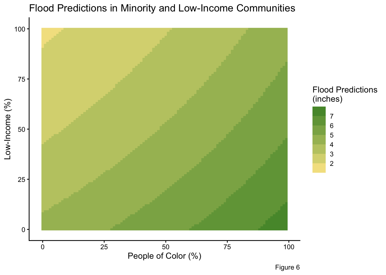
I made two expanded grids to inspect the food predictions when distance from the Hurricane is constant and variable. This allows me to display (1) the interactions of People of Color percentages vs low-income percentages (without the distance from the Hurricane impacting the predictions) and (2) the influence of location relative to the storm on flood exposure.
# Expand grid - Distance held constant
grid_dist_constant <- expand_grid(p_peopcolorpct = seq(min(join_df$p_peopcolorpct), max(join_df$p_peopcolorpct)),
            p_lowincpct = seq(min(join_df$p_lowincpct), max(join_df$p_lowincpct)),
            dist_hur = mean(join_df$dist_hur)) # Hold constant at the mean value
# Expand grid - Distance varies
grid <- expand_grid(p_peopcolorpct = seq(min(join_df$p_peopcolorpct), max(join_df$p_peopcolorpct), length.out = 50),
p_lowincpct = seq(min(join_df$p_lowincpct), max(join_df$p_lowincpct), length.out = 50),
dist_hur = seq(min(join_df$dist_hur), max(join_df$dist_hur), length.out = 50))Make Predictions
Using the tweedie_model, make flooding predictions for the expand grids.
# Calculate flood prediction and put them in new column
prediction_grid_dist_constant <- grid_dist_constant %>% # Distance = constant
  mutate(flood_predictions = predict(object = tweedie_model,
                                     newdata = grid_dist_constant,
                                     type = 'response'))


prediction_grid <- grid %>% # Distance = varies
  mutate(flood_predictions = predict(object = tweedie_model,
                                     newdata = grid,
                                     type = 'response'))
Confidence Intervals
Create confidence intervals for the predictions where the distance is constant.
Code
# Find standard Error
prediction_grid_se <- predict(object = tweedie_model,
                              newdata = prediction_grid_dist_constant,
                              type = 'link',
                              se.fit = TRUE)

# Find inverse link function
linkinv <- family(tweedie_model)$linkinv

#
prediction_grid_dist_constant <- prediction_grid_dist_constant %>%
  mutate(
    # P in link space
    link_p = prediction_grid_se$fit,
    # CI in link space
    link_p_se = prediction_grid_se$se.fit,
    link_p_lwr = qnorm(0.025, mean = flood_predictions, sd = link_p_se),
    link_p_upr = qnorm(0.975, mean = flood_predictions, sd = link_p_se),

    # CI in response space
    prediction_se = linkinv(link_p),
    ci_lower = linkinv(link_p_lwr),
    ci_upper = linkinv(link_p_upr)
  )
Final Plots
Distance from Hurricane = Constant
Investigating community composition (People of Color and low-income populations) in correspondence to flood predictions.
Code
# Geom_rasters plots of flood predictions via minority and low-income %
prediction_grid_dist_constant %>%
  ggplot(aes(x = p_peopcolorpct, y = p_lowincpct, fill = flood_predictions)) +
  geom_raster() +
  scale_fill_steps2(low = "#ffad76",        #- THIS CREATES COLOR BINS
                     mid = "#ffe896",
                     high = "#488f30",
                     midpoint = median(prediction_grid$flood_predictions)) +
  theme_classic() +
  labs(title = "Flood Predictions in Minority and Low-Income Communities",
       x = "People of Color (%)",
       y = "Low-Income (%)",
       fill = "Flood Predictions\n(inches)",
       caption = "Figure 6"
       )
Selecting 3 representative low-income levels at the 10%, 50%, 90% percentiles.
Code
# Three low-income levels at the 10%, 50%, 90% percentile
selected_levels <- quantile(join_df$p_lowincpct, probs = c(0.1, 0.5, 0.9))

selected_levels
10% 50% 90%
5 41 85 Creating a plot at those 3 low-income quantiles.
Code
# Filter for all the values within the p_lowincpct specified percentiles
plot_data <- prediction_grid_dist_constant %>%
  filter(p_lowincpct %in% selected_levels)


# Change labels for quantiles
plot_data <- plot_data %>%
  mutate(lowinc_label = factor(p_lowincpct,
                               levels = selected_levels,
                               labels = c("10%", "50%", "90%")))


# Plot the reduced dataframe - % minorities & flood predictions at low-income's 10th, 50th, and 90th precentile
ggplot(plot_data,
       aes(x = p_peopcolorpct,
           y = flood_predictions,
           color = factor(lowinc_label),   # Different colors for each low-income level
           group = factor(lowinc_label))  # Separate lines
       ) +
  geom_line(size = 1) + # Predicted line
  geom_ribbon(aes(ymin = ci_lower, # Confidence intervals
                  ymax = ci_upper,
                  fill = factor(lowinc_label)), # Per each income percentile
              alpha = 0.2) +
  labs(x = "% People of Color",
       y = "Predicted Flooding",
       color = "Low-Income (%)\nQuartiles",
       fill = "Low-Income (%)\nQuartiles",
       caption = "Figure 7") +
  theme_minimal()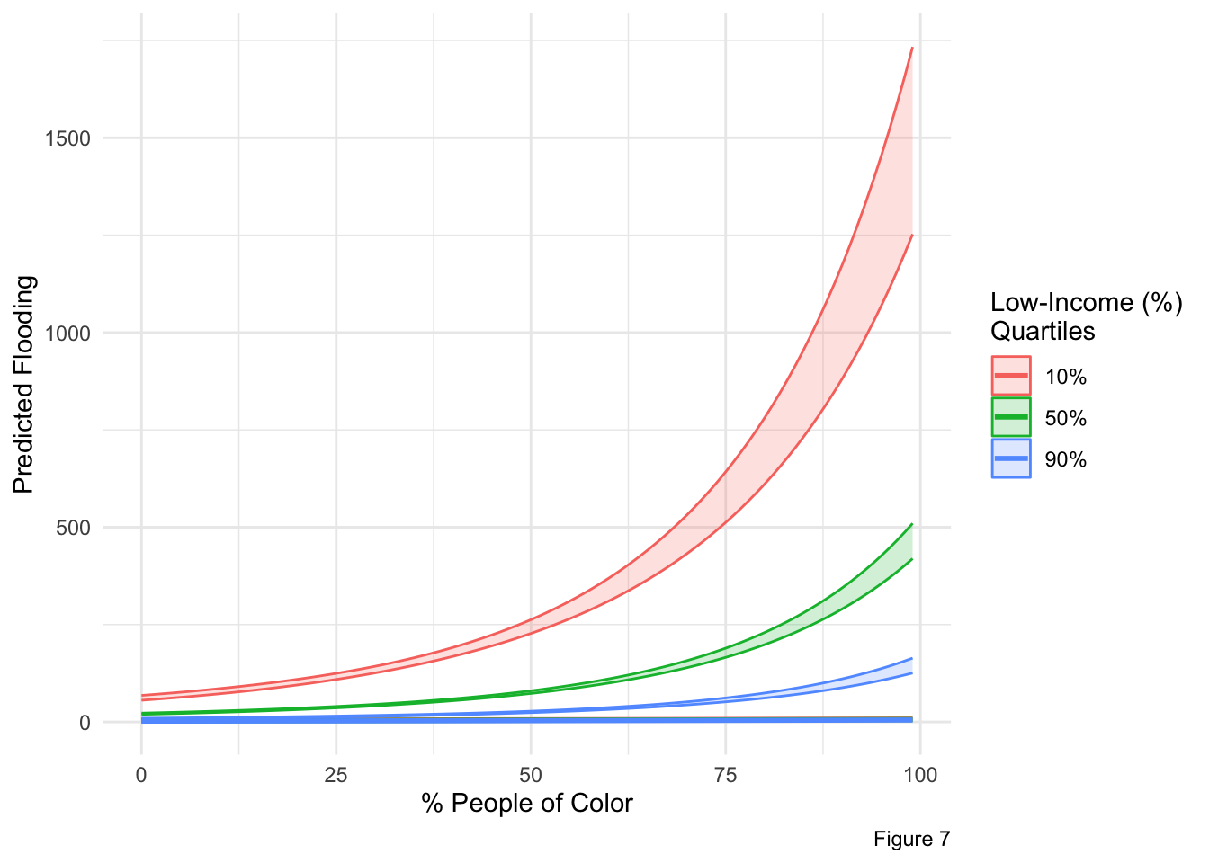
The problem while plotting:
From the expand grid, we could not plot all 50×50 points as lines; ggplot’s line was zigzaged and oscillating through the various combinations. To eliminate this crazy oscillation, we fixed low-income percentages at a 3 representative levels (10th, 50th, 90th percentile), and filtered the data for those fixed percentages. Now, the plot_data has fewer rows (only the combinations of p_peopcolorpct and the 3 fixed low-income levels).
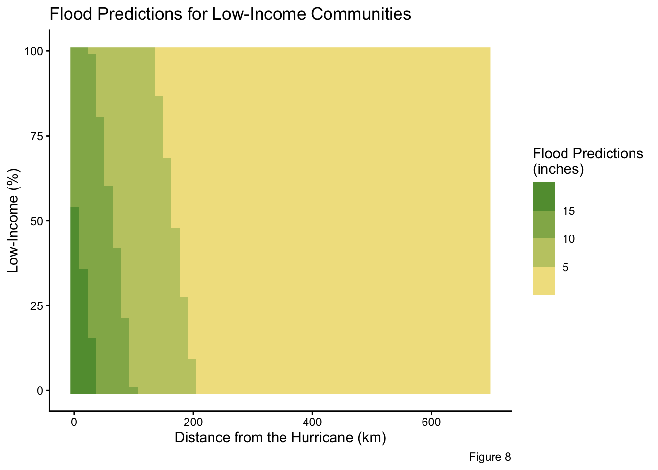
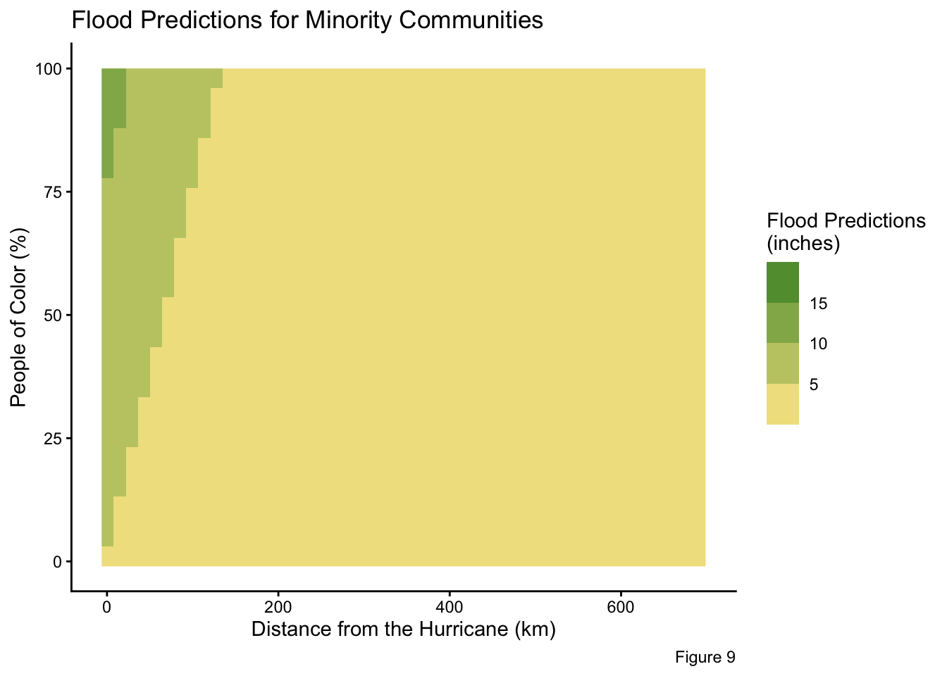
Community Composition in Comparison to their Distance from the Hurricane
Plotting People of Color and low-income percentages in relation to their distance from the storm.
Code
# Geom_rasters plots of flood predictions via minority % and distance from Hurricane
prediction_grid %>%
  ggplot(aes(x = dist_hur, y = p_lowincpct, fill = flood_predictions)) +
  geom_raster() +
  scale_fill_steps2(low = "#ffad76",        #- THIS CREATES COLOR BINS
                     mid = "#ffe896",
                     high = "#488f30",
                     midpoint = median(prediction_grid$flood_predictions)) +
  theme_classic() +
  labs(title = "Flood Predictions for Low-Income Communities",
       x = "Distance from the Hurricane (km)",
       y = "Low-Income (%)",
       fill = "Flood Predictions\n(inches)",
       caption = "Figure 8"
       )
Code
# Geom_rasters plots of flood predictions via low-income % and distance from Hurricane
prediction_grid %>%
  ggplot(aes(x = dist_hur, y = p_peopcolorpct, fill = flood_predictions)) +
  geom_raster() +
  scale_fill_steps2(low = "#ffad76",        #- THIS CREATES COLOR BINS
                     mid = "#ffe896",
                     high = "#488f30",
                     midpoint = median(prediction_grid$flood_predictions)) +
  theme_classic() +
  labs(title = "Flood Predictions for Minority Communities",
       x = "Distance from the Hurricane (km)",
       y = "People of Color (%)",
       fill = "Flood Predictions\n(inches)",
       caption = "Figure 9"
       )
Evaluating Coefficients and Plots
As previously discussed, the percentages of People of Color within a community exhibit a positive, significant relationship to flood exposure. Communities with high minority populations are predicted to experience greater flooding. This trend is illustrated in Figures 6, 7, and 9 where flooding estimates increase with rising percentages of minorities. This interaction is persistent regardless of whether the distance from the hurricane’s path is held constant or varies.
In contrast, the low-income percentages shows a negative, significant relationship to flood predictions. During Hurricane Ian, areas with high low-income percentages (poorer communities), are predicted to have less flooding, which is evident in Figures 6, 7, and 8. Notably, the 10% low-income quartile (representing wealthier communities) experiences the greatest amount of flooding in Figure 7. The separation of prediction lines in Figure 7 highlights the significant effects of low-income percentages on flooding predictions. The negative relationship is opposite of typical expectations. This counterintuitive outcome is likely attributable to the Florida coastline bearing the full force of the storm. Coastal properties, which are typically higher-income and affluent communities, were directly exposed to Hurricane Ian as a Category 4 storm, resulting in greater damage and flooding in these wealthier communities.
Yet, the interaction between these socio-demographic variables (low-income and minority percentages) is not significant when determining flood exposure.
Distance from the Hurricane Ian’s path has a strong negative, significant relationship. Regardless of the community composition, areas closer to the Hurricane’s trajectory experienced greater flooding (Figures 8 and 9). Once communities were approximately 200km from the storm’s path, predicted flooding decreased remarkably.
The R-squared value of 0.214 means the model explains about 21.4% of the variability in flooding intensity. While 0.214 seems low, it is expected in environmental hazard modeling, where flooding is driven by numerous unaccounted factors, such as drainage patterns and land cover. Additionally, Tweedie models, dealing with zero-inflated, skewed, positive data, rarely produce high R-squared values. Thus, an R-squared around 0.2 is considered typical, still reflecting meaningful explanatory power as it is paired with several statistically significant predictors.
Overall, the study emphasizes vulnerability is multidimensional. Social inequality and geographic exposures influence flood outcomes. Supporting the hypothesis, minority communities disproportionately faced greater flooding exposure, and flood severity was mainly driven by proximity to the storm. Contradictory to the hypothesis, low-income percentages have an inverse relationship with flooding. The wealthier, coastal communities faced the brunt of the damage as the Category 4 Hurricane hit Florida’s coast head on. Also against the hypothesis, the combination between the socio-demographic variables do not explain flooding. These results demonstrate the need for risk assessments that combine social and geographic factors to best anticipate who is most vulnerable.
Limitations
This analysis has several limitations. First, this study does not account for other important factors influencing flood intensity, such as urbanization, impermeable surface, or land cover data. Flooding is highly dictated by the water not being able to percolate into the soil due to high levels of cement. Adding a predictor about the land composition and elevation would greatly improve the model. Secondly, an inaccuracy of predictor measurements could be a limitation. American Community Survey census track data and the defined Hurricane path both come with marginal errors that could influence the model. Lastly, flooding can have a spatial autocorrectional that is not accounted for in this model.
References
Bonat, W. H., & Kokonendji, C. C. (2017). Flexible Tweedie regression models for continuous data. Journal of Statistical Computation and Simulation, 87(11), 2138-2152.
Bucci, L., Alaka, L., Hagen, A., Delgado, S., & Beven, J. (2023). National hurricane center tropical cyclone report. Hurricane Ian (AL092022), 1-72.
Dartmouth Flood Observatory. (n.d.). 2022 Hurricane Ian. https://floodobservatory.colorado.edu/Events/2022HurricaneIan/2022HurricaneIan.html
Ford, C. (2025). Getting Started with Tweedie Models. University of Virginia Library. https://library.virginia.edu/data/articles/getting-started-tweedie-models-0
Gilchrist, R., & Drinkwater, D. (2000). The use of the Tweedie distribution in statistical modelling. In COMPSTAT: Proceedings in computational statistics 14th symposium held in Utrecht, the Netherlands, 2000 (pp. 313-318). Heidelberg: Physica-Verlag HD.
Chakraborty, J., Collins, T.W., Grineski, SE. (2019). Exploring the Environmental Justice Implications of Hurricane Harvey Flooding in Greater Houston, Texas. Am J Public Health. Doi: 10.2105/AJPH.2018.304846.
Kochhar, R., and Moslimani, M. (2023). “Wealth surged in the pandemic, but debt endures for poorer Black and Hispanic families.” Pew Research Center. https://www.pewresearch.org/2023/12/04/wealth-gaps-across-racial-and-ethnic-groups/
Rafferty, J.P. (2022). Hurricane Ian. Britannica. https://www.britannica.com/event/Hurricane-Ian-2022.
Roe, J., Aspinall, P. A., & Ward Thompson, C. (2016). Understanding relationships between health, ethnicity, place and the role of urban green space in deprived urban communities. International journal of environmental research and public health, 13(7), 681.
Walls, K. (2022). New data reveals peak of storm surge height during Ian. Scripps https://www.fox4now.com/weather/new-data-reveals-peak-of-storm-surge-height-during-ian.
Citation
BibTeX citation:
@online{hessel2025,
  author = {Hessel, Megan},
  title = {Sociodemographic {Disparities} in {Flood} {Exposure:} {A}
    {Tweedie} {Regression} {Analysis} of {Hurricane} {Ian}},
  date = {2025-12-04},
  url = {https//meganhessel.github.io/Posts/hur_ian_flooding},
  langid = {en}
}
For attribution, please cite this work as:
Hessel, Megan. 2025. “Sociodemographic Disparities in Flood
Exposure: A Tweedie Regression Analysis of Hurricane Ian.”
December 4, 2025. https//meganhessel.github.io/Posts/hur_ian_flooding.